


The Eye Behind the Cover
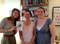
Elizabeth Clark, Caragh O’Brien, and Kate Jacobs in Beth’s office, July 8, 2014
Covers matter, obviously. A good one catches people’s attention, intrigues them enough to take a closer look, and then lures them inside. Getting it right takes knowing the novel, of course, but it also involves a bit of mind reading. Who are the likely readers for this book? Maybe they’re drawn to covers featuring a girl in a flowing dress, or a simple, iconic image. Maybe they want something familiar, or they’re ready for a change. Certainly readers want the cover to be an accurate promise of what’s inside the book. To me, that’s what matters most.

The Flatiron Building, NYC
Imagine, then, my delight with the striking cover of The Vault of Dreamers, my upcoming new novel. It was created by Elizabeth Clark, a brilliant designer and Associate Art Director at Macmillan, and I had the chance to meet Beth when I visited the Flatiron Building last week.
Beth has a warm smile and a direct, kind manner. She works in a tidy white office with books, a computer, framed art, and a plush tiger. When I asked her about how she came up with the cover for Vault, she said she knew right away she wanted to work with an eye. She searched stock photos for the one chose. Some of her early efforts involved an eye inside a triangular shape, but she thought they were too much like another cover she knew, so she kept focusing further into the eye until she found what worked. Then she added the reflection and other design elements.
In short, she nailed it.

Cover design by Elizabeth Clark
My editor Kate Jacobs and I told Beth some of the comments we’ve heard lately about the cover, particularly from our visit to ALA. We’ve heard the eye altogether looks like a super nova, and that the iris colors are like an electrical storm or an explosion. Some readers have commented on how the outer dial evokes a camera lens, or a lock on a vault, or a compass. Quite a few people have told me that they love how clean and simple the design is, and others are drawn to the creepy factor. They’re intrigued. They’re excited to see something different. To me, the overall effect of hyper-awakeness suggests imagination, speed, and cunning. It’s perfect for a book about dreams and art and taking risks.
Beth said the final version on the hardcover will have a shiny, tactile quality to it, and I’m curious to see how that will look and feel. I like the idea that a reader could be curled up with the novel, sucked into the story, and subconsciously noting the unusual feel of the cover all the while. The cover will be part of the story, too. Just as it should be.


 Book Trailer for Promised
Leave a Reply